![]()
Not sure if you saw this yet, or realized it was different.
The changes are small, but significant.
We’ve changed the name to “crossroads” with a lowercase ‘c’.
The reason is that we want to stress crossroads as an experience, rather than as a thing.
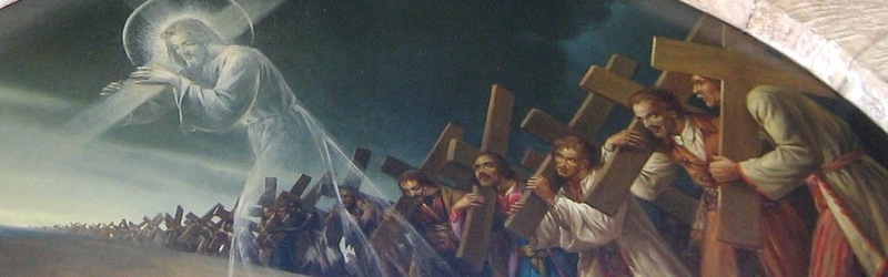
For us, the crossroads experience is when the reality of God in Christ intersects with our own lives, and we are faced with a choice – how will we respond.
This can happen anywhere, anytime, and this is what we want to promote.
The crossroads experience can happen in a bar, on the bus, at a barmitvah, under an umBrella, it doesn’t have to be at a church.
Another change is that we dropped the words “community”.
I find the word “community” is a dangerous adjective.
If its true, that is, if we really are a friendly, welcoming community, we won’t need to say it, people will sense it.
But if its not true, then get rid of the word, its misleading.
Oh yeah, and we dropped the word “church”.
Why?
Well, in part because many people have negative vibes about the church.
But the big reason is to shift the focus away from a building or a place.
People automatically think building or place, whereas we want to communicate experience.
We want to be a part of the Jesus movement, a local gathering of people who have had a close encounter with God of the Jesus kind.
Hopefully, as with the experience of community, people will be able to figure out just by being with us, what we are.
Anyway, that’s our new logo.